By ERIC WEINBERG | Viterbo University
As a historian and a data scientist, I always have been fascinated by the origin of things. For my quest to create a more informative interactive online COVID-19 map began with a bit of a whimper.
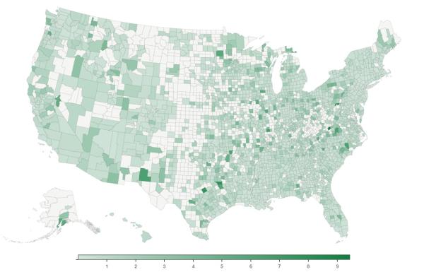
After looking at the publicly available maps and being involved in many conversations, I found it hard to understand and talk about some fundamental facts. In particular, there was very little information of where COVID-19 was most prevalent per capita.
My wife, who is a nurse, was seeing her role transform as a result of the pandemic, working on the front lines helping our community. Meanwhile, I was working from home, watching the world change.
After a couple of weeks, I encountered other data scientists online who were similarly frustrated with available information—and they were doing something about it. They were gathering and merging data, which they were making publicly available. Over the course of a few nights, I began to analyze the data using statistical software. And that was it for a few days.
Soon after, however, I became increasingly motivated to do something as well—no matter how small—to help. I slowly realized that the data I was looking at should be more easily accessible, and I knew through previous projects how I could build a simple map to visualize some of this statistical information.
I also began online conversations with various groups and people who began providing me data. Eventually, I became involved with the United Kingdom’s Office of National Statistics Data Science Campus, which developed a method to get social mobility data from Google into a format I could use. Soon after, an early interactive map was put online. Then the project grew (when I was able to give it time).
It grew as result of a lot of input and collaboration. This included the data scientists mentioned earlier, and also other Viterbo University faculty members, who also began to advise on the project. David Bauer and Chris Mayne, in particular, helped me think about how to present the information in a way that benefits the general public rather than just data scientists.
During a time when we are purposefully socially isolated, it was quite rewarding to receive feedback from such a diverse group of people across the globe.
As a result, the Balefire COVID-19 USA Data Explorer is now operational. The goal of the map is to be a usable way for the public to better understand COVID-19 and our communities. While it shares similarity to other maps we have all seen, our tool gives users the ability to view relationships between COVID-19 and social factors such as income inequality and residential social isolation.
Users can also view change over time. They can look at confirmed cases, fatalities, and rate of increase at the county, state, and national level as well as a host of other data points.
It is hard to imagine the future of the site as it is a very tenuous time and planning is difficult even at the daily level, but I hope it continues to grow and helps people understand COVID-19 and how it is affecting our communities a little better.
Eric Weinberg is a data scientist who teaches history and runs Viterbo University's website. He lives with his wife, Therese (a 2017 Viterbo graduate) and two children in Onalaska.


